Headlines Chocolate
Overview:
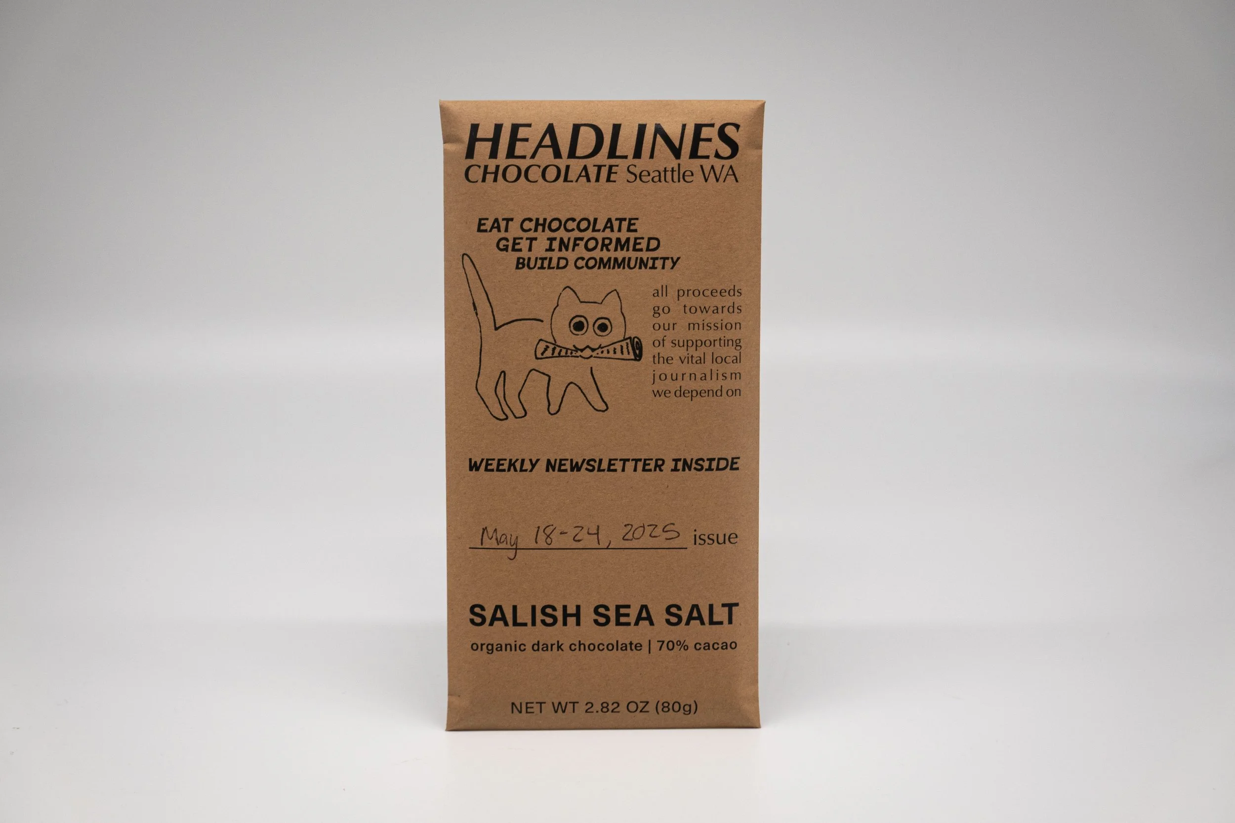
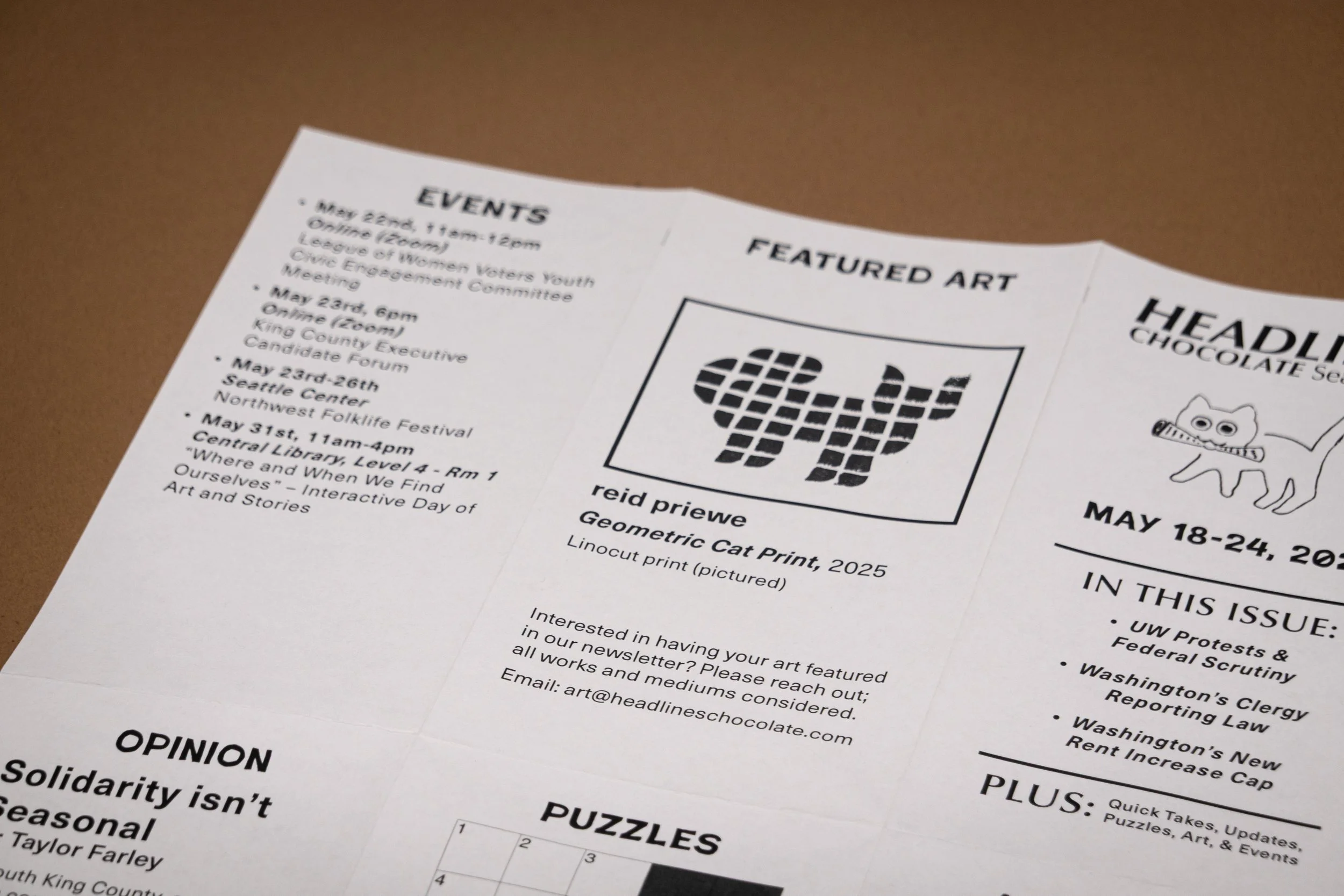
Headlines Chocolate offers an accessible way to engage with local news at a time when news fatigue is high. Each package contains a chocolate bar and a weekly newsletter. The goal is to build a routine of picking up a treat and getting important updates, helping foster a more informed community.
Roles: Packaging | Visual Design | Print | Branding
Timeline: 8 Weeks
Tools: InDesign | Photoshop
Problem to solve:
Many people feel fatigued by streams of journalism such as TV, social media, and other digital platforms, which deliver a constant and overwhelming flow of information.


Audience:
The audience for Headlines Chocolate includes socially conscious individuals who value sustainability, community, and ethical consumption. Many are regulars at co-ops or independent grocers and seek products that align with their values. Others care deeply about social issues but feel disconnected from traditional journalism and overwhelmed by the pace of digital news. They are looking for a more grounded, approachable way to stay informed about their local community.
Process:
Color:
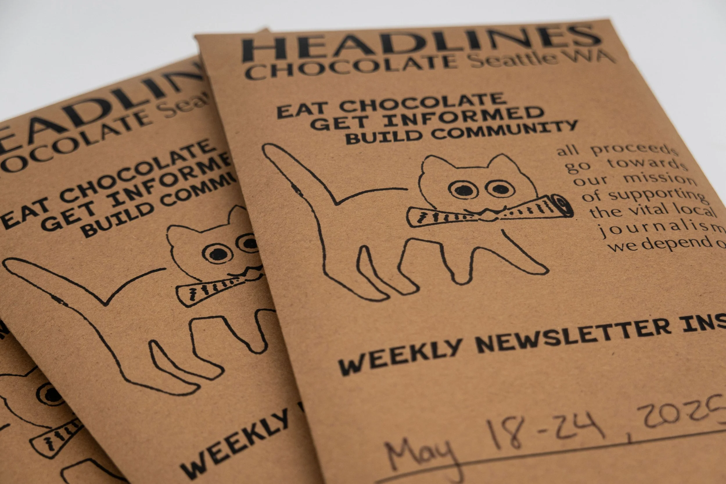
Headlines Chocolate is printed using only black ink. This limited palette reflects our values of simplicity, accessibility, and sustainability. It keeps costs low for our community-minded audience and makes it easier to partner with small local print shops. The brown paper used for the exterior packaging contrasts with the white paper of the newsletter, helping both pieces stand out and highlight each other.

Illustration:


Dielines:
The dielines for both the chocolate bar envelope and the newsletter were designed to fit standard 8.5” x 11” paper. This makes the packaging more modular and compatible with a wider range of printing methods, allowing us to choose the most sustainable option.


Typography:


Final Thoughts:
I created Headlines Chocolate to offer a more inviting and tangible way to engage with local news. Designed for socially conscious readers, the packaging combines a bar of chocolate with a black and white newsletter, printed on standard paper stocks for accessibility and sustainability. It is a small gesture with a bigger purpose, meant to be picked up, enjoyed, and shared as part of a weekly routine that connects people to their community.